QUINN DIZON
DATA SCIENTIST, DEVELOPER, MUSICIAN
Audio Comparison Toolkit
In this article, I demonstrate some custom ways I created to visually compare the frequency domains of multiple audio files. These tools could be useful in many situations. For the music enthusiasts here, we can use these tools to check the differences between releases of the same song (something I demonstrate in this article). Or maybe you work in the audio recording/editing industry. These can be used to see how your own masters change at various stages of the process, or even to visualize the effects of microphone placement in a space.
Basically, if you’ve got two audio files, these tools give you a way to see the differences between them!
If your interested in using some of the code you see here, go checkout the github repo for this project.
Project & Demonstration
I’m working in python for this project, and I use a package called Librosa and a process called FFT (Fast Fourier Transform) to extract frequency data from my audio files. If you’re interested in learning more about libroso and the ways it can help you work with audio in python, they have some great docs here.
Everything is built around two custom classes I designed for this project. One handles the audio processing and the other helps produce comparative visualizations.
These tools can compare just about any two audio files to each other. But where I think they really shine is showing the differences between relatively similar files. Because of this, I demonstrate their use on an original version, and two remastered versions of the song, Yesterday, by the Beatles. You can listen to recordings of each version below.
1965 Original
2009 Remaster
2015 Remaster
Before reading on, I encourage your to listen through a few seconds of each to see if you can hear some of the differences. Can you concretely define those differences? If not, hopefully this analysis will help you see and understand how the audio has changed from version to version.
Let’s get started!
Loading the Data
Getting audio data into Librosa is actually quite simple, but the analysis and frequency conversion can take a bit of code. For best analytical results we need to know the sample rate of each of our files, and it’s also best if those sample rates match between files. Here, they are all 44.1 kHz (a pretty standard sample rate).
My AudioAnalyzer class takes care of the heavy lifting for getting the audio into librosa and transforming it into the frequency domain. Again, if you’re interested in seeing the full code for any of this, go check out my project repository.
input_sr stands for input sample rate, and is set to 44100 for each file. We also have fft_size set to 44100. FFT is basically a way of taking time domain data and creating a specified number of bins in which to place frequency information. In matching our FFT size to our sample rate, we are making it so that each of these bins is exactly 1 Hz. If you’re interested in reading more on FFT, check out this page.
Behind the scenes, we’re loading the audio, passing it through FFT processing, and then averaging the amplitudes of each frequency bin to get a single spectrum for each file.
The AudioAnalyzer class can already produce a simple spectrogram for us.
As you can see from the code, I have specified a minimum and maximum frequency. This is just so that we can zero in on a specific range where we will be able to see everything a little more clearly. Also, notice in the graphs below that the y-axis (amplitude) has been scaled for each spectrogram to be between 0 and 1. When comparing these spectrograms, it is helpful to have everything on the same scale.


From these charts, you probably think that they look rather similar. That’s because they do. Comparing the frequency domains side by side like this is pretty hard to do (and is why I am writing this article!). Luckily, I have another class that can help us to better visualize and compare the differences.
Comparing the Audio
I handle the comparison between two audio files with another class — SpectrumCompare. This class takes in two of our previously created AudioAnalyzer instances and runs some calculations in the background to help us compare them.
Let’s take a look.
Simple as that! We can now call a few different plotting methods on our orig_to_09 instance to compare the original 1965 version against the remastered 2009 version.
First, let’s plot the spectrograms from these two files on top of each other.

With this visual, it is already much easier to compare the frequency spectrums of these two versions.
From a quick glance, it appears that the remastered version has higher amplitudes across all frequencies. But is the difference in amplitude consistent across all ranges? If not, where are the greater differences? Luckily, SpectrumCompare can help us answer these questions!
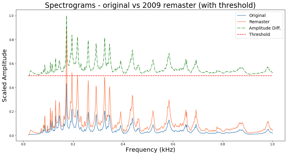
By passing a few other arguments in our plot_spectrum_group, we can see how the amplitude changes over the various frequency bins. The green line here shows the difference in scaled amplitudes, and the red line is the threshold. When the green line is above the red line, it means that the remastered version has a higher amplitude in that frequency bin. When it is below(which we don’t see in this particular case), it means that the original has a higher amplitude at that frequency.
Note: the order in which you add your
AudioAnalyzerinstances to theSpectrumCompareinitialization will determine which side of the red line means more amplitude for which spectrum. The first one in gets the lower half and the second one gets the upper half. See the project repo for more information.
We can confirm our last observation that the remastered version tends to have greater amplitude across the plotted spectral range. We can even see where many peaks form and where they start to flatten out after about 700 Hz.
While this graph certainly lets us visualize more about this comparison, I think it can be simplified a bit and still give all the same general information. For this, we can use the SpectrumCompare.plot_spectrum_heatmap method.
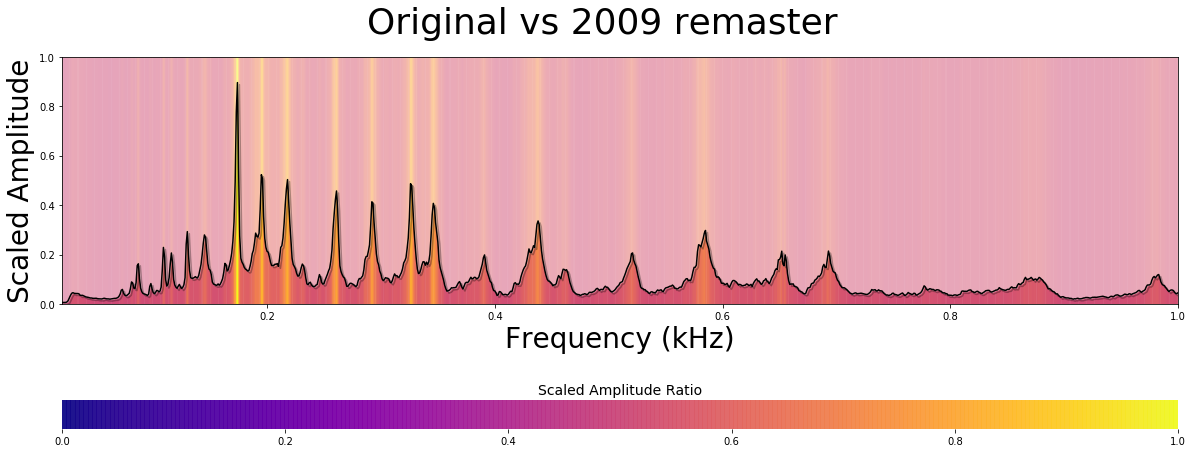
Great! Now this is much more pleasing to look at, and delivers all the same information. Our red and green lines have been replaced by the heatmap background. Through this heatmap we can see that there are a few particular hotspots. If we want to get a little more precise about our analysis, we can use the frange parameter to zoom in on a particular range. Here it looks like most of the hotspots occur between 100–500 Hz (a pretty meaty range for a lot of male vocal and instrumental music).
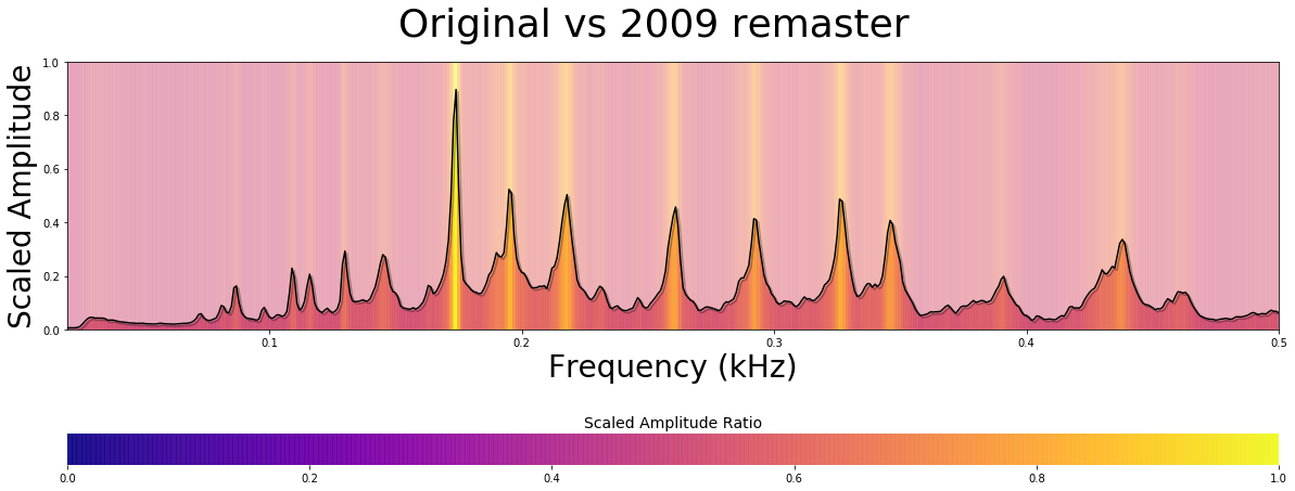
At this closer scale, we can see that somewhere around 180 Hz there is a pretty significant hotspot indicating that the remastered version has higher amplitude at that frequency. That range corresponds to around F3, which is a comfortable male vocal range and right in the middle of the guitar range. This also happens to be the key for this song (F major). Furthermore, we can see these hotspots begin to fade as we get closer to 500 Hz.
So one conclusion we can make from this visual analysis is that the remastered version seems to place emphasis on bringing out this range around 180 Hz through 500 Hz. These hotspots are relatively contained, and we don’t see any particularly wide regions where the amplitude has been boosted significantly in the remaster. So these are some subtle changes that will likely reflect a little more emphasis on the main vocal and instrumental lines.
With this quick rundown of the process out of the way, lets look at some other comparisons between these different versions.
Next up, let’s compare the original 1965 version to the 2015 remaster.
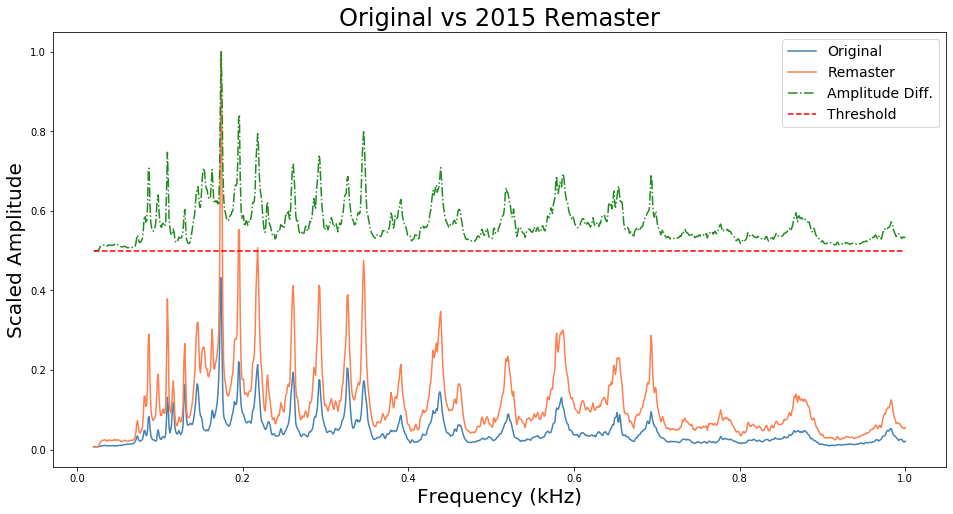
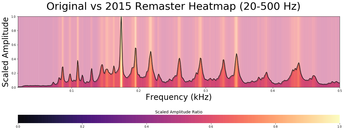
Let’s start with the similarities between this comparison and the last one. From the spectrum group plot, we can again see a general increase in amplitude across all plotted frequencies in the remastered version. However, if we look around the 100–400 Hz range, the increase in frequency seems a little more broad. That is to say that it isn’t just focused around a few peaks, but a little more spread out across the whole range.
To confirm this, we can look at our heatmap plot. Sure enough, we see some wider hotspots below the 180 Hz range. Also, the hotspots around 90 Hz and 110 Hz seem a little brighter to me here. This would all seem to indicate that, in addition to emphasizing the middle vocal range, this 2015 remaster has some general bass boost thrown in.
But to really test this, let’s compare the two remastered versions.
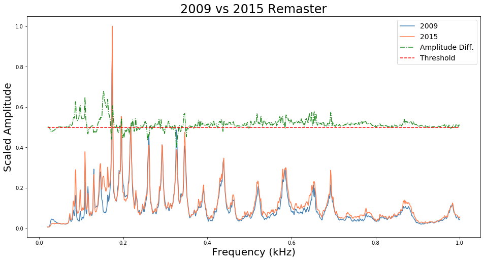
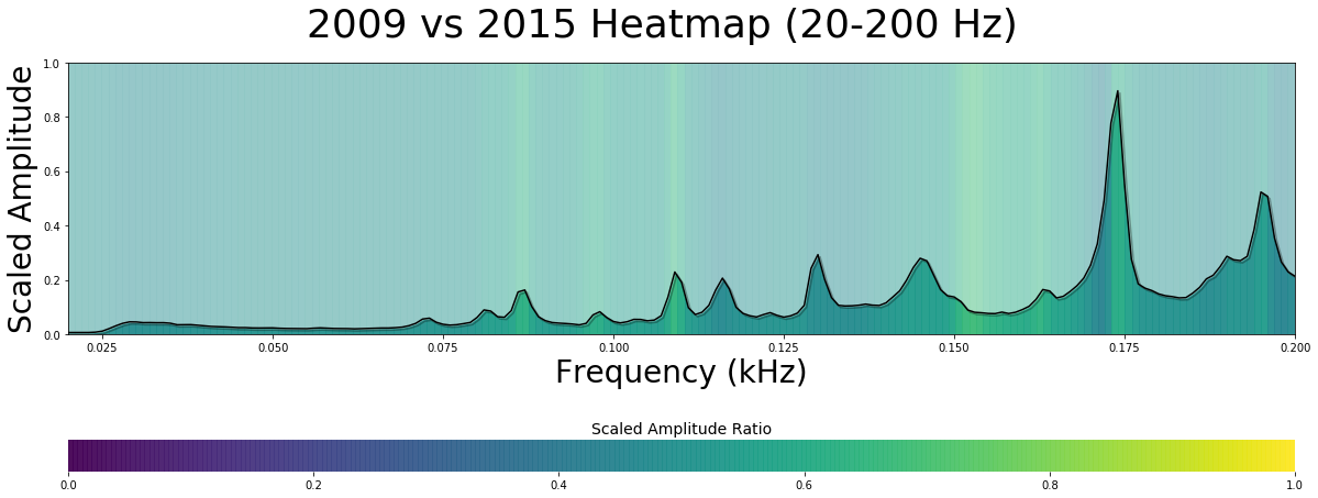
These results aren’t as pronounced, which is an interesting observation in itself. Basically, these two remasters make a lot of the same aesthetics choices when it comes to altering the EQ.
In our spectrum group plot, our green line is hovering mostly around our red line. Since the 2015 version was the second input for our SpectrumCompare class, that green above the red line means that the 2015 remaster has higher amplitudes at those frequencies. There are a some places where it dips below the threshold, meaning that the 2009 version has more amplitude there, but there are only a few such instances.
What is particularly interesting is that we can see some greater amplitudes in the 2015 version between 100–200 Hz. Just as I suspected, the 2015 remaster seems to have some bass boost.
This is confirmed by looking at our heatmap. Here, I have limited the range from 20–200 Hz so we can see this lower range in detail. Though the hotspots are not incredibly pronounced, we can certainly see them below the 180 Hz mark. Therefore, we can be confident that the 2015 version does in fact have some bass boosting that the 2009 remaster does not have.
TL;DR
If you skipped all the wordy bits and just glanced through the graphs, here is the conclusion. Both the remastered versions appear to be louder than the 1965 original, and are relatively similar to each other. In particular, the remasters emphasize the main vocal and instrumental range of the song (between 180–500 Hz), and the 2015 adds some bass boost to that EQ as well.
With this in mind, you might want to go back and listen to the three versions again to see if you can hear these features. Also, see if you prefer one over the others. I personally think that the 2009 remaster balances the melodic emphasis and overall clarity very well.
Again, feel free to poke around my github repository for this project and try the code out on some other audio.
I hope you enjoyed this brief exploration of visual audio comparison. Thanks for reading!